사용 데이터셋
https://www.data.go.kr/dataset/3035522/fileData.do
현재 이 데이터셋은 폐기 되었다고 나온다.
위 공공데이터를 사용하여 인프런강의 (공공데이터로 파이썬 데이터 분석) (https://bit.ly/3sISk6Z) 의 방법으로 전처리한 데이터로 시각화 정리 진행한다.

cf1) figure, axes 생성
fig=plt.figure(figsize=(10,3), dpi=100)
ax1=fig.subplots()
cf2) 모든 x tick 표현하기
_=plt.xticks(ticks=np.arange(len(df)), labels=df.index)
cf3) x축 소수점 제거
from matplotlib.ticker import MaxNLocator
ax1.xaxis.set_major_locator(MaxNLocator(integer=True))
(cf4) 그래프의 밖에 Legend 표시하도록 설정
plt.legend(bbox_to_anchor=(1.05, 1), loc=2, borderaxespad=0.)
lineplot
1. pandas plot
(1) pandas plot의 기본 plot - lineplot
- df의 index 또는 column 값을 기준으로 그려짐
df.plot(figsize=(10,3))
cf) 모든 x tick 표현하기
_=plt.xticks(ticks=np.arange(len(g)), labels=g.index)
- df 의 column이 여러 개 존재할 때 (df의 column이 seaborn의 hue역할)
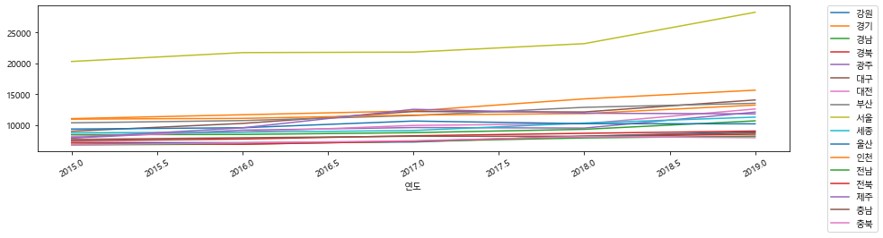
2. seaborn plot
sns.lineplot(data=df, x="연도", y="평당분양가격", hue="지역명", ci=None, ax=ax1)
ax1.legend(bbox_to_anchor=(1.02, 1), loc=2)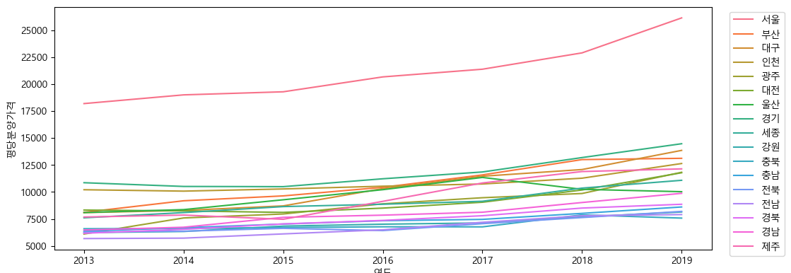
pointplot
sns.pointplot(data=df, x="연도", y="평당분양가격", hue="지역명", ci=None, ax=ax2)
ax2.legend(bbox_to_anchor=(1.02, 1), loc=2)
barplot
1. pandas plot
(1) df.plot(kind='bar')
- df의 index 또는 columm 값을 기준으로 그려짐
df.plot.bar(rot=0, figsize=(10, 3))
# or
df.plot(kind='bar',rot=0, ax=ax1)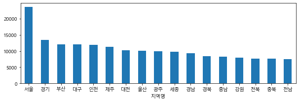
(2) df.plot.bar()
df.plot.bar(color='g',rot=0, figsize=(10,3)) # cmap='Pastel1' 또한 가능
- column 여러개일 때 ( df의 column이 seaborn의 hue와 같은 역할)
ax=df2.plot.bar(figsize=(10,3), rot=0)
ax.set_ylabel('평당분양가격')
2. seaborn plot
sns.barplot(data=df, x="지역명", y="평당분양가격")
# estimator default: mean
# color changable
# palette (https://seaborn.pydata.org/tutorial/color_palettes.html)
# ci: bootstrap resampling (with replacement), sorted means
- hue 지정
sns.barplot(data=df, x="지역명", y="평당분양가격", hue='연도', ci=None)
histplot
1. pandas plot
(1) df.plot(kind='hist') or df.plot.hist()
df.plot(kind='hist', figsize=(10, 3), title='평당분양가격')
# or
ax=df.plot(kind='hist', figsize=(10, 3))
ax.set_title('평당분양가격')
df["평당분양가격"].plot.hist(bins=50)
(2) df.hist(bins=)
df["평당분양가격"].hist(bins=50)
axs=df.hist(bins=50, figsize=(10,10))
ax1,ax2,ax3,ax4=axs.flatten()
ax2.set_title('ax별 제목 지정 가능')
2. seaborn plot
sns.histplot(df["평당분양가격"], kde=True)
kdeplot
1. seaborn plot
sns.kdeplot(data=df['평당분양가격'])
sns.kdeplot(data=df[['평당분양가격','분양가격']])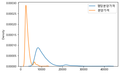
boxplot
1. pandas plot
(1) df.plot(kind='box')
df.plot(kind='box', figsize=(5, 5))
(2) df.plot.box()
- df 의 column이 x축
df.plot.box(fontsize=15)
- 이중 column일 경우
df.plot.box(figsize=(15, 3), rot=30)
(3) df.boxplot(column='', by='')
- by: x축
df.boxplot(column='평당분양가격',by='연도', figsize=(5,3), rot=30)
- by가 리스트일 때
df.boxplot(column='평당분양가격',by=['연도','전용면적'], figsize=(20,3), rot=30)
2. seaborn plot
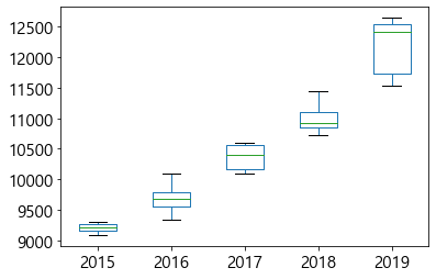
sns.boxplot(data=df, x="연도", y="평당분양가격")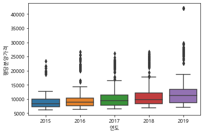
- hue 지정
plt.figure(figsize=(12, 3))
sns.boxplot(data=df_last, x="연도", y="평당분양가격", hue="전용면적")
violinplot
1. seaborn plot
sns.violinplot(data=df, x="연도", y="평당분양가격")
- hue 지정
plt.figure(figsize=(12, 3))
sns.violinplot(data=df, x="연도", y="평당분양가격", hue="전용면적")
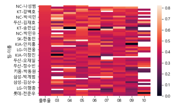
heatmap
1. seaborn plot
plt.figure(figsize=(15, 7), dpi=100)
ax=sns.heatmap(df, cmap="Blues", annot=True, fmt=".0f")
2. matplotlib pcolor
fig=plt.figure(figsize=(15,5), dpi=100)
ax=fig.subplots()

t2=t.iloc[::-1]
t2
hm1=ax.pcolor(t2, cmap="Blues")
_=fig.colorbar(hm1, ax=ax)

col_len=len(t2.columns)
row_len=len(t2.index)
for r in range(row_len):
    for c in range(col_len):
        _=ax.text(c+0.5, r+0.5, int(t2.iloc[r, c]),ha="center", va="center", color="k", fontsize=11)

_=ax.set_xticks(np.arange(col_len)+0.5)
_=ax.set_xticklabels(t2.columns)

_=ax.set_yticks(np.arange(row_len)+0.5)
_=ax.set_yticklabels(t2.index)
'데이터 분석 이론 > 시각화' 카테고리의 다른 글
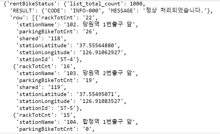
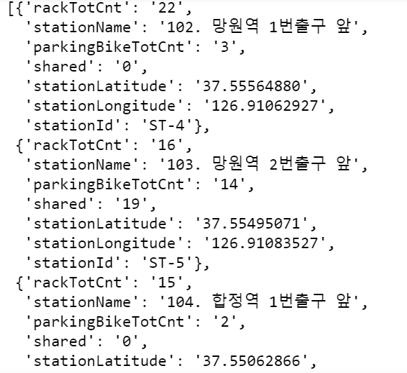
| [시각화 분석 프로젝트] 3-2 서울시 따릉이 대여 현황 지도 만들기 (open API, folium 라이브러리) (0) | 2021.08.17 |
|---|---|
| [시각화 분석 프로젝트] 3-1 open API 신청 & 활용 (서울 열린데이터 광장) (0) | 2021.08.17 |
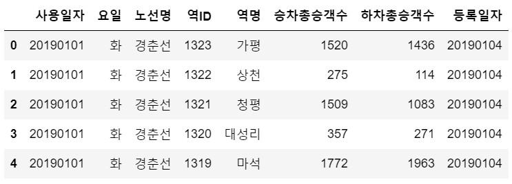
| [시각화 분석 프로젝트] 2-3 승차수가 가장 많은 지하철 역 분석 (0) | 2021.08.11 |
| [시각화 분석 프로젝트] 2-2 지하철 승객수가 많은 날? (0) | 2021.08.11 |
| [시각화 분석 프로젝트] 2-1 pandas로 여러 csv 파일 합치기 (0) | 2021.08.11 |